Headspace Rebrand
Brand Identity
Brand + Campaign Look & Feel
Motion Design
Keeping calm and keeping on.
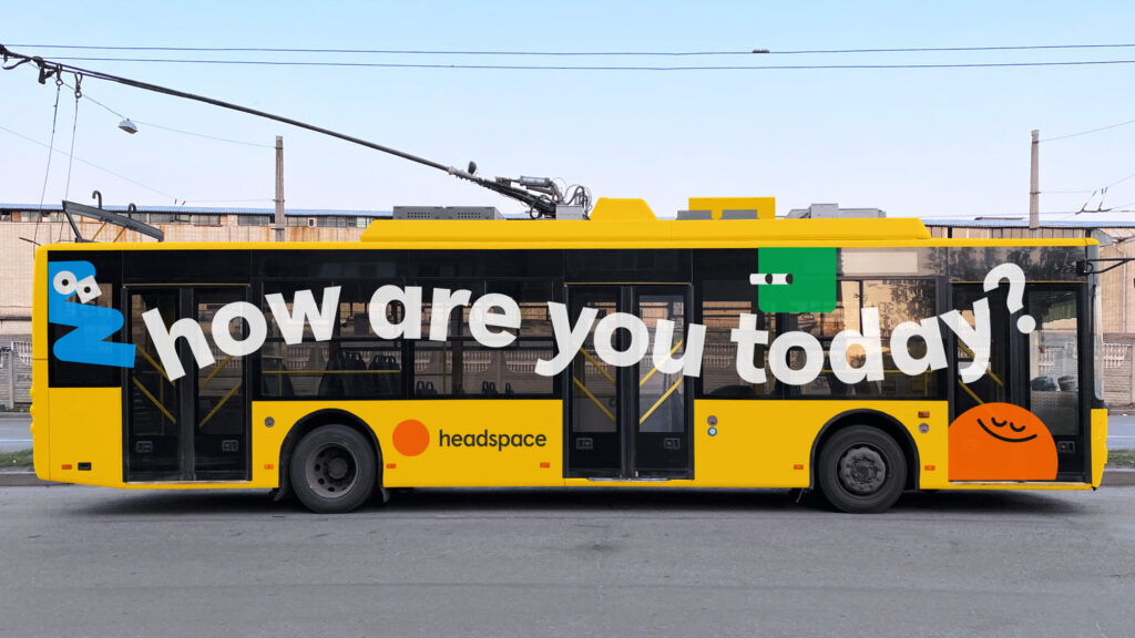
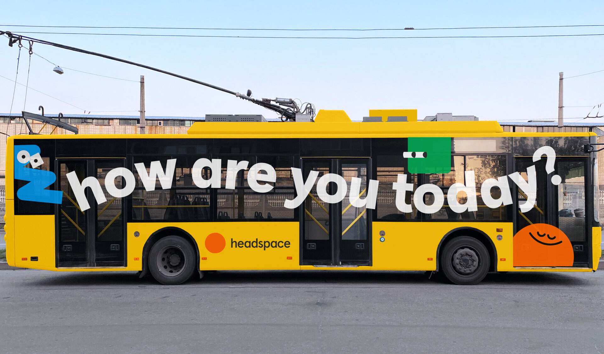
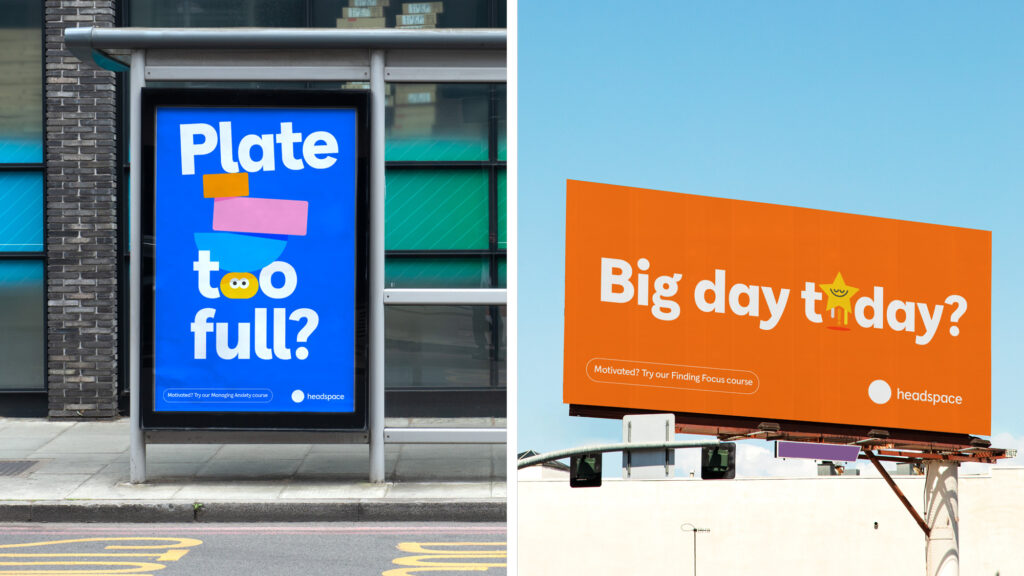
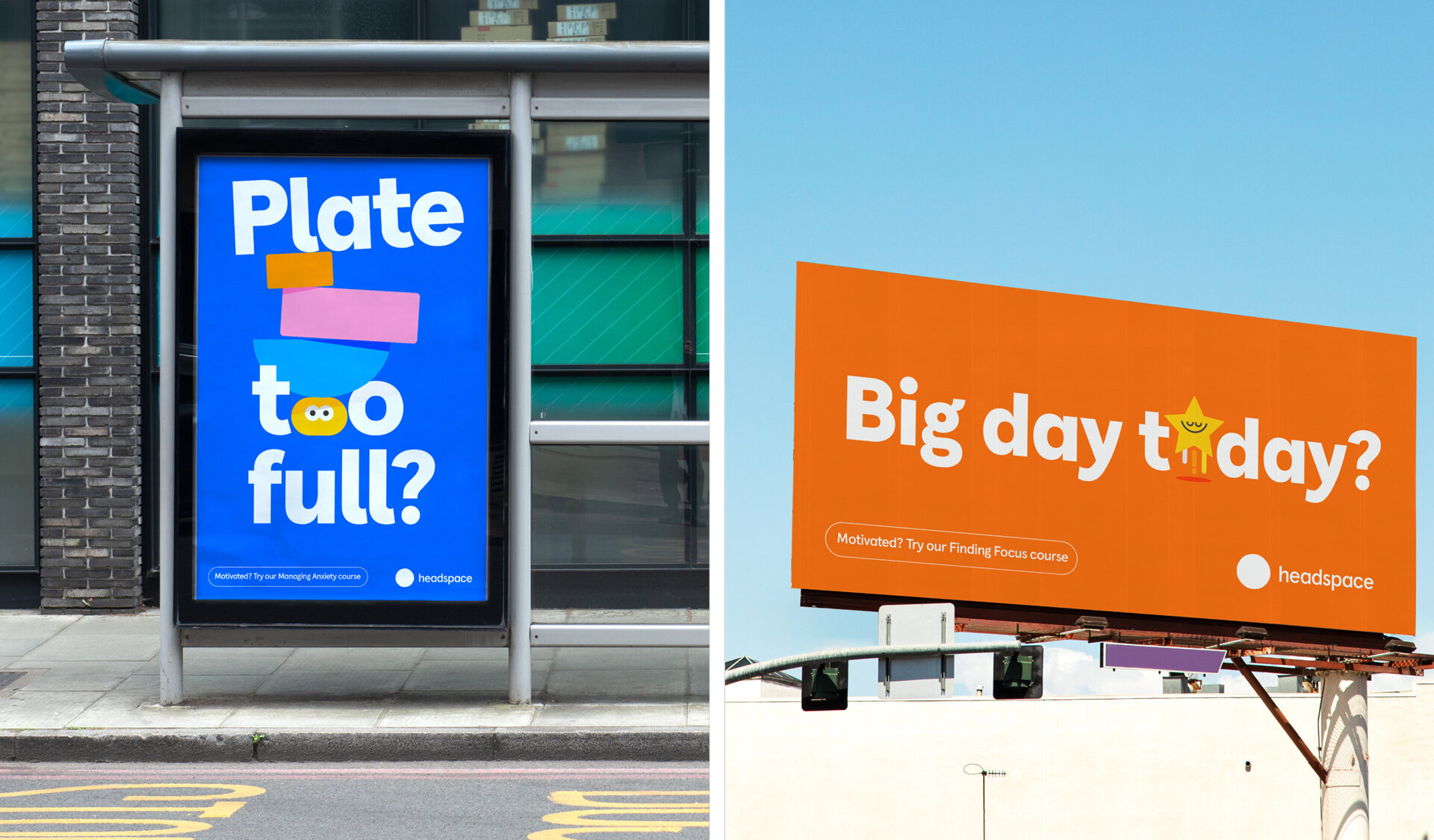
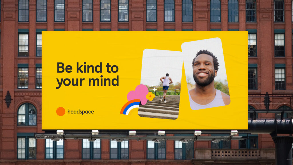
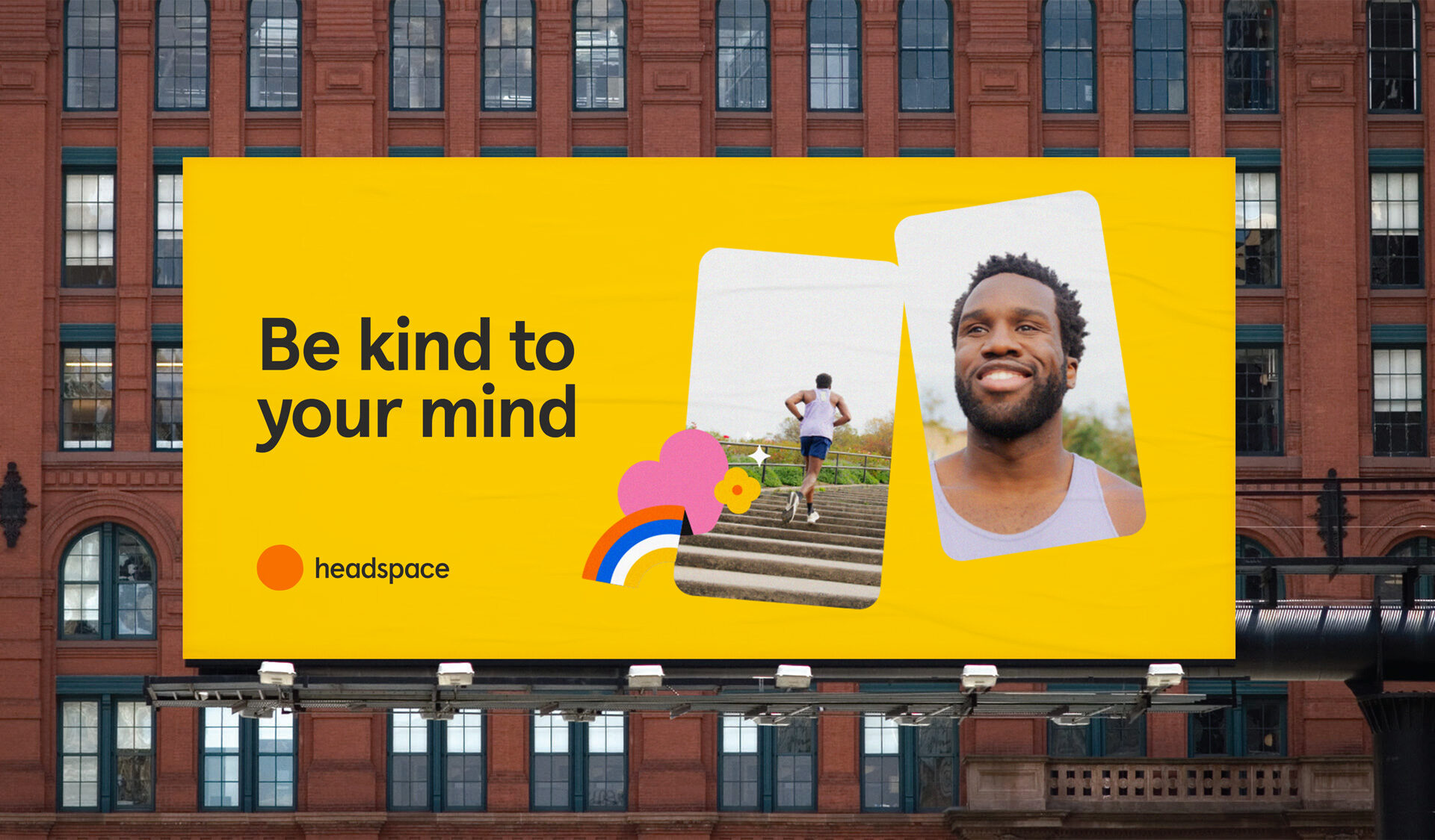
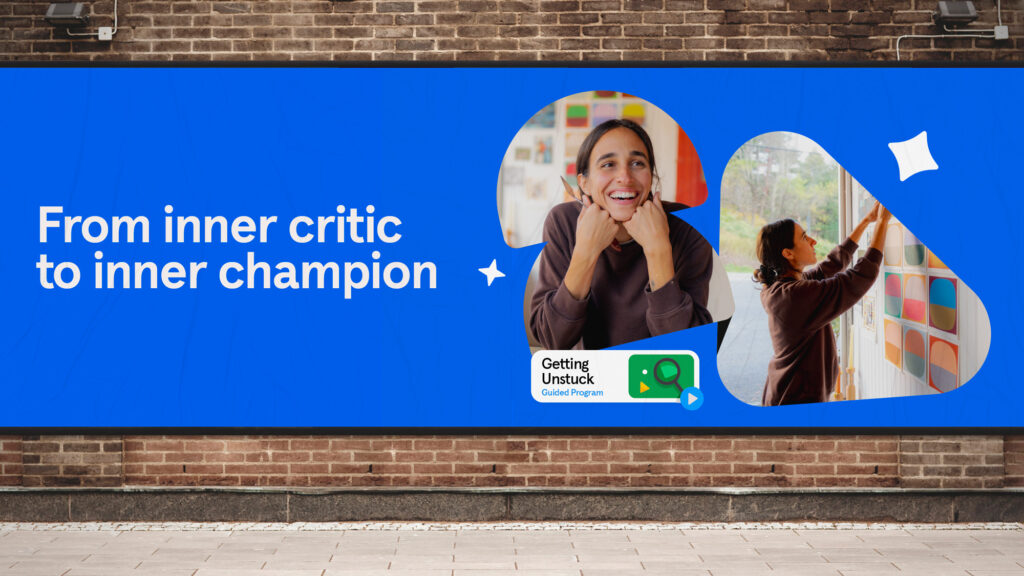
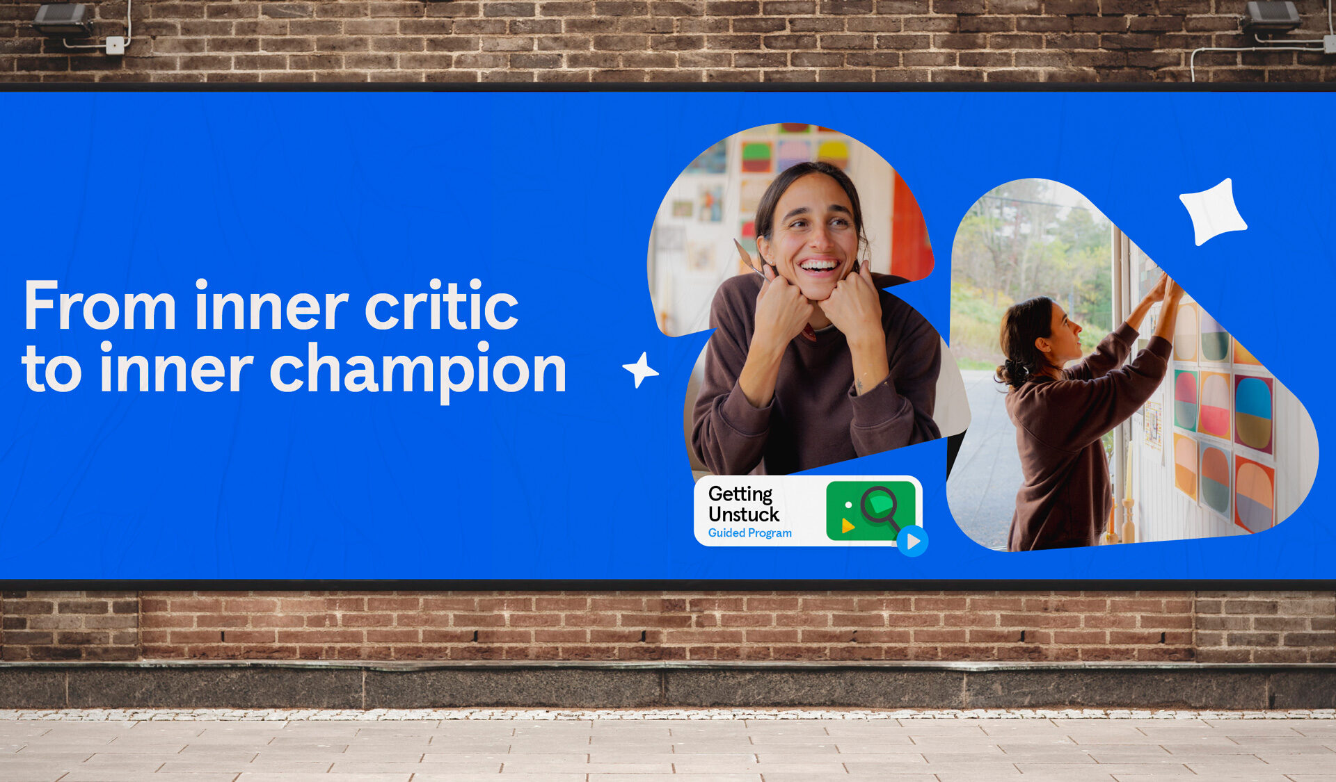
The opportunity: The world’s largest meditation app was growing and needed to speak to a wider audience. Our solution: We built on the foundation of the brand to evolve it, not re-invent it. The result was a simpler, bolder, colorful identity that is poised to stand the test of time.
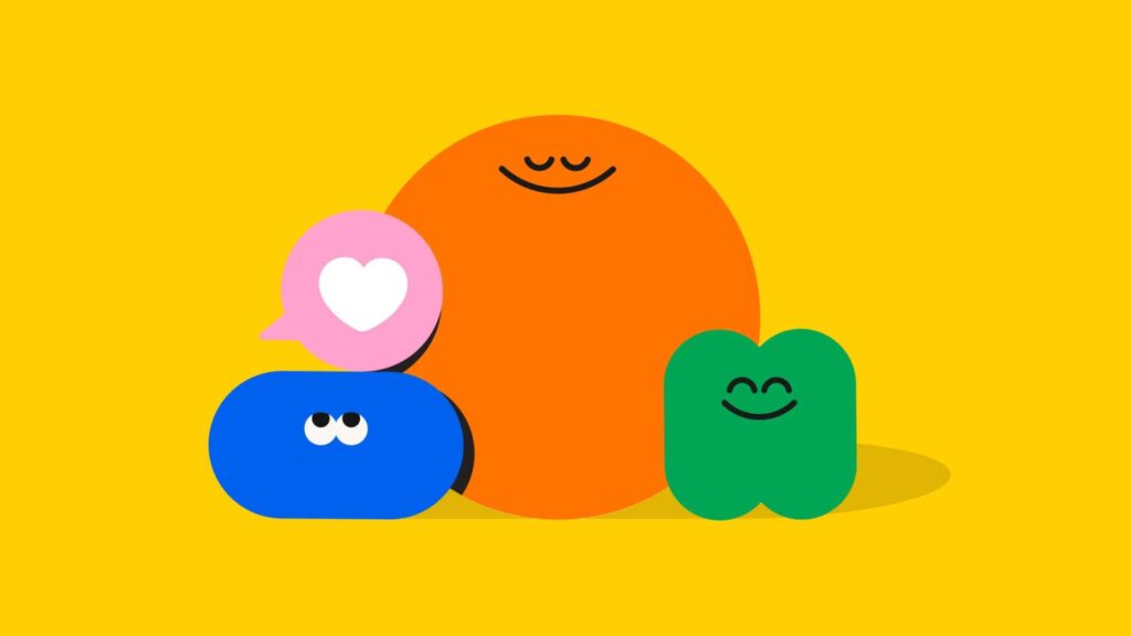
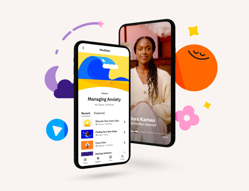
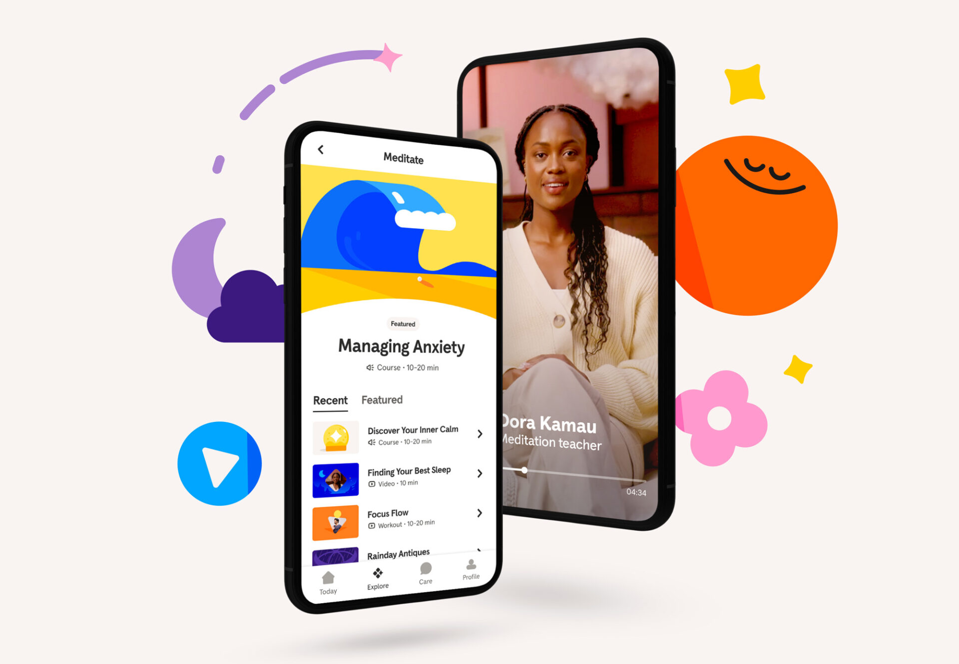
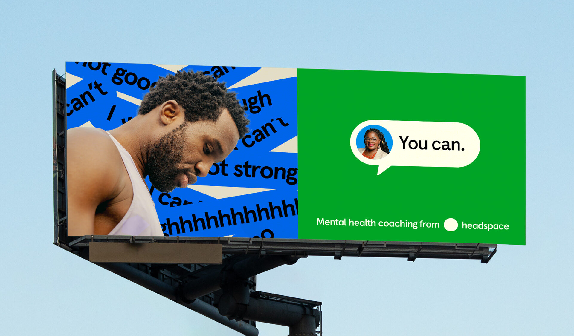
Over the course of six months, we partnered with the internal design team at Headspace to give the brand a new identity that would reach a mass audience as meditation has become a mainstream activity for most of the world now. Through many iterations and design explorations, we ultimately pushed the boundaries of the brand look & feel into a bolder, more colorful territory that was able to incorporate photography, texture, depth, a new custom typeface developed by Colophon Foundry, and a simplified illustration library. The brand evolution we designed extended to animations, digital, print and outdoor marketing materials.